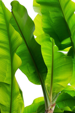
With fashion weeks soon coming to an end, I thought it was only fitting to talk about one of the biggest trends in design for 2017 - Pantone's Colour of the Year - a decision that not only inspires the design world around us, but also reflects the current climate of humanity. And with that, I am excited to announce that the Pantone Colour of the Year 2017 is Greenery. Colour 15 - 0343.
"Greenery bursts forth in 2017 to provide us with the reassurance we yearn for amid a tumultuous social & political environment. Satisfying our growing desire to rejuvenate & revitalise, Greenery symbolizes the reconnection we seek with nature, one another & a larger purpose."
As always, Pantone has a solid reason behind their choice. In a world where we are so submerged in modern technology & stress, Pantone are offering us an escapism, a way to immerse ourselves in the purity of nature. The refreshing, zesty yellow-green shade is symbolic of new beginnings, just like the first days of spring, when nature's greens revive, restore & renew.
Not only does the colour stand for the freedom that is nature, but is a comment on the environment & the new lifestyle we idealise. As we continue to push forward in trying to live greener, our desires to reconnect with nature & a cleaner lifestyle are growing greater. We want purity & light in our homes. We are more conscious than ever about eating more naturally & living healthier. And we are demanding more conscious & responsible behaviour from everyone - grocers to manufacturers to technology - everyone.
In a world were we depend on technology so deeply, we need a moment to pause. To take a deep breath, oxygenate & regenerate.
This 2017, Pantone has given us the gift of Greenery. Nature's neutral, pure, flourishing sustenance. A colour to inspire our own pursuit of personal passions & vitality this year.
Fashion | Conscious, Neutral & Rich
The industry has begun to reevaluate it's priority's - from sourcing materials & labour more consciously, designing for longevity & educating customers on environmental issues within the industry - some companies are leading the way, but there is still a long way to go. Meanwhile, aesthetically, designers have been celebrating mother nature's rich colour palettes & intricate details.
Food | Healthy, Clean & Natural
We are becoming ever more aware of what we put into our bodies. We are desiring to live healthier, eat cleaner & are choosing more natural options over manufactured. Clean, natural food recipes are only going to grow in popularity this year, as we all yearn to revitalise our bodies.
Interiors | Fresh, Light & Pure
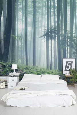
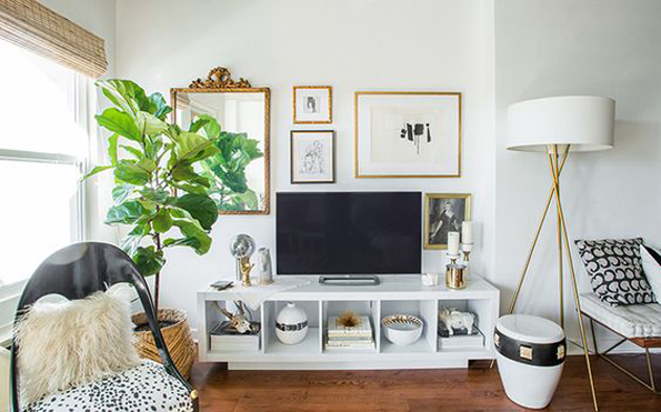
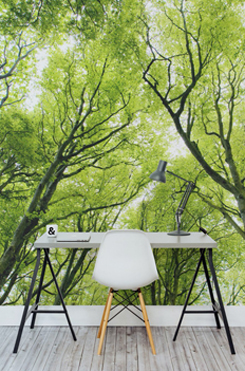
We desire a light, airy, spacious interior - with a nod towards nature. A space where we can relax, but that is not so minimalist that it has no character. The popularity of household plants are still growing, as they allow us a touch of escapism, by bring the great outdoors indoors & oxygenating the room. White may be the background, but look out for natural wood & a celebration of anything leafy. Colours are either pastel & complimentary, rich & breathtaking or metallic signatures, to flash out from the greenery.
Colour Palettes | A Little More Inspiration for You
T R A N S I T I O N S
G R A N D C A N Y O N
F O R E S T F L O O R
R E V I T U P
F A T H O M L E S S
A N A L O G O U S
M O O D Y B L O O M S
C A L M I T D O W N
I hope that has given you your fill of visual inspiration today! I know I'm currently redecorating my house in my head! But in case you still want more, head over to my Pinterest page.


No comments:
Post a Comment